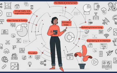
What exactly is a logo?
Amazon’s orange arrow extends from A to Z, indicating its broad product line and the dimpled smiles of its satisfied customers. In a word, a logo is a mark composed of text and graphics that a business uses to identify its offering. A logo should showcase a brand to an audience while distinguishing it from competitors. It will be dense with meaning and effectively express a company’s industry, services, demographics, and ideals so that people can quickly decide if it is for them.
Keep things simple
Apple ditched its previous intricate logo in favour of a simple one that stormed the globe.
Design for an audience
Chupa Chups’ playful brand appeals to both children and adults.
Every brand will have a target audience, and you should evaluate its distinguishing characteristics, including gender, age, geography, income, employment, and so on. You should also conduct market research and observe the competitors, but don’t let industry rules limit you. “Rules are there to be broken.” “You have the essentials, but they’re well-worn, and people become tired of them.” There is a lot of great branding with a very naive approach, and it is very much intended for a higher-end adult audience; it’s all in the execution.”
Make it memorable
Swooshy ‘V’ person logo ideas are many.
With thousands of new businesses starting each year, developing a logo that stands out from the crowd is difficult. Avoid patterns and symbols seen in generic-looking designs, such as globes, cityscapes, and swooshy ‘V’ persons. “There are so many resources out there for people to be’inspired’ and take very liberally from current content,” Tamarin says, adding that borrowing from a brand’s history may help keep a logo new. “The holy grail of branding is to be able to express a company’s narrative in a logo.”
Make it classic
Since 1885, Coca-red Cola’s cursive script logo has remained almost unaltered.
Another challenge in logo design is creating a current and timeless style. “Everything changes so rapidly these days that anything may become really fashionable and extremely outdated in seconds,” Tamarin explains. “Avoid anything very fashionable since it will most likely be out of style by the time you finish the branding job.” Since they are essential, simply typographic logos may seem refined and ageless, and they are unlikely to become kitsch or outmoded.”
Make it adaptable and scalable
The new Slack logo is more adaptable than the previous 18o-angled symbol.
Another area where logos might need to be corrected in translation is color. “Many folks design using only RGB in incredibly bright colors and then print it, and it looks flat and terrible.” Make sure you understand the distinctions between RGB, CMYK, and Pantone and how things will convert between digital and print.”

0 Comments