Also read >>> 10 logo design principle part-1
Make use of a high-quality typeface
Google switched from serif to sans-serif fonts.

The typeface (or fonts) employed in a logo, whether traditional serif, sharp sans serif, or flowing script, says a lot about the brand it represents. In an ideal world, we’d all have the skills to create a completely unique typeface from scratch, but there’s no shame in sprucing up an existing one. “Even if you just take a typeface and change it up a little bit so there’s a little quirk in it that makes it unique, it individualizes it.” That goes a long way to making something just a word into a brand mark.
Use colour strategically
Red is a popular but strong color for logos.

Different colors elicit different emotions, and it’s no surprise that the most prevalent colors used in prominent company logos are blue (which is supposed to generate feelings of serenity, stability, and trust) and red (which evokes thoughts of energy, passion, and action).95% of firms use no more than two colors in their logos, and it’s usually assumed that a signature color may increase brand identification by 80%.
Make it memorableIt should look excellent in black and white
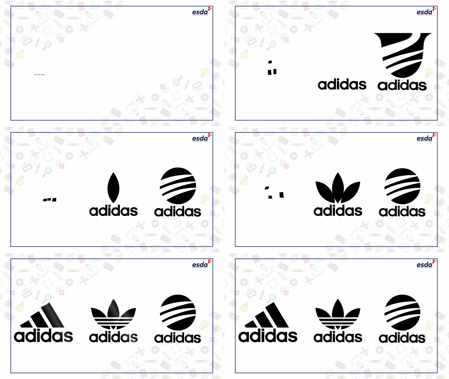
Adidas looks great in monochromatic.

We’ve already covered the significance of color, but a logo should never rely just on its hue. “There are so many occasions where a brand’s mark will appear in black and white,” noting that when a logo is combined with others, it will often appear in monochrome. “A logo must be legible in greyscale or black and white.”
Balance it out
The golden ratio was used in the creation of Twitter’s logo.

Humans are hardwired to see balanced visuals as attractive, and there are several tried-and-true design ‘laws’ (the golden ratio, the rule of thirds) that assist with logo layout. However, mathematical balance is not synonymous with visual balance. Adjustments should be made based on your vision. “The thing about balance is that it’s not always literal balance.” “It’s not like a logo has to be equal, symmetrical, or anything. It just looks good. Something happening in one location should be offset and anchored in another.”
Maintain brand consistency
Gap made the mistake of a ‘corporate’ rebranding and quickly returned to its traditional logo.

Above all, every design decision must be consistent with the story and attitude of the company a logo symbolizes. “This brings us back to strategy and why it’s critical to understand the brand’s purpose, personality, and offering.” “You must have that in stone and always refer back to it in everything you do to communicate that brand.”


0 Comments